
使用方式
1 使用svg 2 png图片 3 css3 动画 4 使用webgl 5 canvas 6 使用glsl
发现很多东西本身html 里面已经有了,关键是要熟悉和使用。现在先做基本的东西,等基本的创造好了,就可以打造科技界面了。读者请耐心等待
1 svg 圆
先打造一个基本界面,再使用动画来动起来 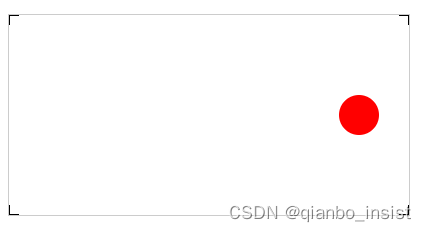
围绕圆圈开始亮点旋转
        .text {
            font-size: 64px;
            font-weight: bold;
            text-transform: uppercase;
            fill: none;
            stroke-width: 2px;
            stroke-dasharray: 90 310;
            animation: stroke 6s infinite linear;
        }

        .text-1 {
            stroke: #3498db;
            text-shadow: 0 0 5px #3498db;
            animation-delay: -1.5s;
        }
         @keyframes stroke {
		100% {
		stroke-dashoffset: -400;
		}
		}
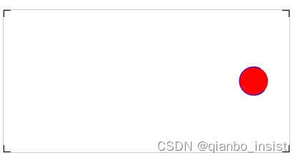 线条开始围绕圆圈动画
    var circle = document.getElementById("testCircle");
    circle.addEventListener("click", function (e) {
        console.log("Click circle ...");
        circle.setAttribute("r", 25);
        circle.setAttribute("fill","blue");
    }, false);
点击以后圆的半径放大到25
codeDOCTYPE html>
webrtc sfu
video {
border: 1px solid black;
width: 640px;
height: 360px;
}
.local {
border: 1px solid red;
width: 640px;
height: 360px;
}
.red {
fill: red;
}
.fancy {
fill: none;
stroke: black;
stroke-width: 3pt;
}
#testSvg {
border: 1px solid #ccc;
}
.testSvg {
border: 1px solid #ccc;
}
#testSvg circle {
fill: red;
stroke: blue;
stroke-width: 1;
}
#svgBox{
width:100%;
margin:100px auto;
}
.text {
font-size: 64px;
font-weight: bold;
text-transform: uppercase;
fill: none;
stroke-width: 2px;
stroke-dasharray: 90 310;
animation: stroke 6s infinite linear;
}
.text-1 {
stroke: #3498db;
text-shadow: 0 0 5px #3498db;
animation-delay: -1.5s;
}
.text-2{
stroke: #f39c12;
text-shadow: 0 0 5px #f39c12;
animation-delay: -3s;
}
.text-3{
stroke: #e74c3c;
text-shadow: 0 0 5px #e74c3c;
animation-delay: -4.5s;
}
.text-4{
stroke: #9b59b6;
text-shadow: 0 0 5px #9b59b6;
animation-delay: -6s;
}
@keyframes stroke {
100% {
stroke-dashoffset: -400;
}
}
观沧海
观沧海
观沧海
观沧海
var circle = document.getElementById("testCircle");
circle.addEventListener("click", function (e) {
console.log("Click circle ...");
circle.setAttribute("r", 25);
circle.setAttribute("fill","blue");
}, false);
可以使用transform 来制作动画,具体下一节讲吧 #testCircle:hover{ transform:scale(1.5) /* transform:translate(-50%,-50%) scale(1.5) */ }

