
目录
介绍
背景
使用代码
兴趣点
- 下载源代码 - 1.6 KB
这篇文章是关于使用线性回归分析进行预测的。在GUI环境中使用它的好处是可以进行交互,并且可以实时看到改变自变量对因变量的影响。
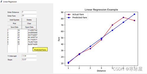
背景线性回归是一种分析方法,它估计具有一个或多个自变量的线性方程的系数,这些自变量最能预测因变量的值。线性回归拟合一条直线,以最小化因变量的实际值和预测值之间的差异。线性回归最适合并被企业广泛用于评估趋势并进行估计或预测。我用于演示的示例基于根据行驶距离预测要支付的票价。由于界面是图形化的,所以很容易输入距离并得到预测的票价结果。
线性回归方程可以表示为Y = a + bX, 其中X是自变量,Y是因变量。术语b方程中表示直线的斜率并且a表示截距,其是的值Y时X是零。
使用代码程序需要以下import内容:
from tkinter import *
from tkinter import messagebox
from tkinter.tix import *
import pandas as pd
from sklearn.linear_model import LinearRegression
import matplotlib.pyplot as plt
from matplotlib.backends.backend_tkagg import FigureCanvasTkAgg
import os
主程序主要包括使用Tkinter和声明所需变量来设计应用程序的用户界面。以下是相同的Python代码:
distances = []
fares = []
data = {}

window = Tk()
window.title("Linear Regression")
window.geometry("800x500")

tip = Balloon(window)

lbldistance = Label(window,text="Enter Distance: ",anchor="w")
lbldistance.place(x=50,y=50,width=100)

txtdistance = Entry(window)
txtdistance.place(x=150,y=50,width=100)

lblfare = Label(window,text="Enter Fare: ",anchor="w")
lblfare.place(x=50,y=75,width=100)

txtfare = Entry(window)
txtfare.place(x=150,y=75,width=100)

btnadd = Button(window,text="Add/Update",command=add)
btnadd.place(x=50,y=100,width=100)

btndelete = Button(window,text="Delete",command=delete)
btndelete.place(x=150,y=100,width=100)

btnplot = Button(window,text="Plot",command=plot)
btnplot.place(x=50,y=125,width=100)

btnclear = Button(window,text="Clear",command=clearplot)
btnclear.place(x=150,y=125,width=100)

btnsave = Button(window,text="Save Data",command=savedata)
btnsave.place(x=50,y=150,width=100)

btnopen = Button(window,text="Open Data",command=opendata)
btnopen.place(x=150,y=150,width=100)

lstdistance = Listbox(window)
lstdistance.place(x=50,y=175,width=67)

lstfare = Listbox(window)
lstfare.place(x=120,y=175,width=67)

lstpredfare = Listbox(window)
lstpredfare.place(x=190,y=175,width=67)

lblintercept = Label(window,text="Y-Intercept: ",anchor="w")
lblintercept.place(x=50,y=350,width=100)

txtintercept = Entry(window)
txtintercept.place(x=150,y=350,width=100)

lblslope = Label(window,text="Slope: ",anchor="w")
lblslope.place(x=50,y=375,width=100)

txtslope = Entry(window)
txtslope.place(x=150,y=375,width=100)

lstdistance.bind("",listselected)

tip.bind_widget(lstdistance,balloonmsg="Distances")
tip.bind_widget(lstfare,balloonmsg="Actual Fares")
tip.bind_widget(lstpredfare,balloonmsg="Predicted Fares")

window.mainloop()
以下add()用户定义函数用于添加或更新存储为列表的距离和票价。如果距离不在列表中,它会添加新的距离和票价,如果距离已经添加,则更新票价。然后它使用updatelists()用户定义的函数来更新前端GUI中的数据,最后调用plot()用户定义的函数来绘制数据。
def add():
      if txtdistance.get() in distances:
         i = distances.index(txtdistance.get())
         distances[i] = txtdistance.get()
         fares[i] = txtfare.get()
      else:
         distances.append(txtdistance.get())
         fares.append(txtfare.get())
      updatelists()
      plot()
下面是updatelists()函数的代码。
def updatelists():
      lstdistance.delete(0,END)
      lstfare.delete(0,END)
      for distance in distances:
           lstdistance.insert(END,distance)
      for fare in fares:
           lstfare.insert(END,fare)
以下用户定义plot()函数用于绘制图表。数据存储为距离和票价列表的字典。模型是来自sklearn.linear_model包的LinearRegression类的实例。该fit()函数用于训练模型,该predict()函数用于生成预测票价。然后使用matplotlib库根据距离绘制实际和预测票价。
该intercept_属性用于显示Y-intercept,该coef_属性用于显示slope线性回归线的 。
FigureCanvasTkAgg类用于在Tk中嵌入plot。clearplot()用户定义的函数用于绘制新的情节,以防止多个地块被嵌入之前清除旧的情节。
def plot():
      distances = list(lstdistance.get(0,lstdistance.size()-1))
      if len(distances) == 0:
         return
      fares = list(lstfare.get(0,lstfare.size()-1))
      distances = [int(n) for n in distances]
      fares = [int(n) for n in fares]

      data["distances"] = distances
      data["fares"] = fares

      df = pd.DataFrame(data)
      X = df[["distances"]]
      y = df["fares"]

      model = LinearRegression()
      model.fit(X,y)

      y_pred = model.predict(X)

      lstpredfare.delete(0,END)
      for n in y_pred:
           lstpredfare.insert(END,n)

      txtintercept.delete(0,END)
      txtintercept.insert(0,str(round(model.intercept_,2)))

      txtslope.delete(0,END)
      txtslope.insert(0,str(round(model.coef_[0],2)))

      clearplot()

      fig = plt.figure()

      ax = fig.add_subplot(111)
      ax.plot(X,y,color="red",marker="o",markerfacecolor="blue",label="Actual Fare")
      ax.plot(X,y_pred,color="blue",marker="o",markerfacecolor="blue",label="Predicted Fare")
      ax.set_title("Linear Regression Example")
      ax.set_xlabel("Distance")
      ax.set_ylabel("Fare")
      ax.legend()

      canvas = FigureCanvasTkAgg(fig,master=window)
      canvas.draw()
      canvas.get_tk_widget().pack()
下面是clearplot()函数的代码:
def clearplot():
  for widget in window.winfo_children():
       if "Canvas" in str(type(widget)):
          widget.destroy()
以下delete()函数用于从列表中删除任何distance和fare并更新绘图。
def delete():
  try:
     d = lstdistance.get(lstdistance.curselection())
     if d in distances:
        i = distances.index(d)
        del distances[i]
        del fares[i]
        lstdistance.delete(i)
        lstfare.delete(i)
        lstpredfare.delete(i)
        plot()
  except:
        pass
以下listselected()函数用于在屏幕上显示从List中选择的distance和fare。
def listselected(event):
  if len(lstdistance.curselection()) == 0:
     return
  i = lstdistance.curselection()[0]
  txtdistance.delete(0,END)
  txtdistance.insert(END,distances[i])
  txtfare.delete(0,END)
  txtfare.insert(END,fares[i])
可以使用如下savedata()函数将当前distances和fares列表保存到CSV文件中:
def savedata():
  pd.DataFrame(data).to_csv("data.csv",index=False)
可以使用以下opendata()函数从保存的CSV文件中加载保存的distances和fares:
def opendata():
      if os.path.exists("data.csv"):
          data = pd.read_csv("data.csv")
          values = data.values
          lstdistance.delete(0,END)
          lstfare.delete(0,END)
          distances.clear()
          fares.clear()
          for row in values:
               lstdistance.insert(END,row[0])
               distances.append(str(row[0]))
               lstfare.insert(END,row[1])
               fares.append(str(row[1]))
      else:
          messagebox.showerror("Error","No data found to load")
注意:必须在打开现有保存的数据后单击该plot按钮才能更新绘图。
兴趣点我一直在寻找某种方式以交互方式绘制机器学习算法的数据,我突然想到Tkinter将是它的最佳选择。
https://www.codeproject.com/Articles/5311775/Linear-Regression-with-Tkinter