本文主要是对官方文档的翻译。
一、Qss作用与规则Qss(Qt style sheet)是一种样式文本规范,可以使用QApplication::setStyleSheet()来设置整个应用的样式或者使用QWidget::setStyleSheet()设置某个QWidget(包括其子类)窗体的样式。Qss具有级联属性,即假设在不同的级别设置了多个样式表,那么Qt将从所有设置的样式表中派生出有效的样式表。样式表可以让您执行所有类型的定制,这些定制仅使用QPalette是很难或不可能执行的。例如,你想要黄色背景作为强制字段,红色文本作为潜在的破坏性按钮,或者花哨的复选框,样式表就是答案。
样式规则由一个选择器(selector)和一个声明(declaration)组成。选择器指定哪些Widget受到该规则的影响;声明指定应该在Widget上设置哪些属性。例如:QPushButton { color: red } ,QPushButton是selector,{color:red}是declaration,这个规则指定QPushButton和其子类应该使用红色作为前景色(文本颜色)。样式规则中的申明部分是由一个{property:value}表组成的,例如:QPushButton { color: red; background-color: white }。当多个类型的Widget具有相同的{property:value}时也可以在selector部分使用逗号隔开,例如QPushButton, QLineEdit, QComboBox { color: red }。
二、selector类型Qt样式表支持CSS2中定义的所有选择器。下表总结了常用的选择器类型。
selector 示例 解释Universal Selector
* 匹配所有WidgetType Selector
QPushButton
匹配所有QPushButton组件和其子组件Property Selector
QPushButton[flat="false"]
匹配所有非平面(flat="false")属性的QPushButton。这种过滤器中过滤的对象需要先设置QVariant支持的类型属性(setProperty(“flat”, “false”))。
警告:如果在样式表设置之后Qt属性的值发生变化,可能需要强制样式表重新计算。实现此目的的一种方法是取消样式表的设置并再次设置它。
Class Selector
.QPushButton
匹配QPushButton组件,但是不包含其子类。ID Selector
QPushButton#okButton
匹配所有对象名是okButton的QPushButton控件Descendant Selector
QDialog QPushButton
匹配QPushButton的所有实例,它们是QDialog的后代控件(子控件、孙控件等)。Child Selector
QDialog > QPushButton
匹配QPushButton的所有实例,它们是QDialog的直接子对象。 三、Property类型下表列出了Qt样式表支持的常用属性(所有属性见https://doc.qt.io/qt-5/stylesheet-reference.html)。可以给属性赋哪些值取决于属性的类型。除非另有说明,以下属性适用于所有小部件。标记有星号*的属性是特定于Qt的,在CSS2或CSS3中没有相同的属性。
Proprty 类型 解释 alternate-background-color Brushalternate-background-color主要用于 QAbstractItemView子类,用来设置视图文本的交替背景色(需要设置视图的交替背景色属性)。例如:
QTreeView {
    alternate-background-color: blue;
    background: yellow;
}
background
Background
设置窗体背景的简写,包括设置background-color, background-image, background-repeat, background-position等.例如:
QTextWdit {background:red};
QFrame {background:url(:/img/first.jpg)};
background-color
Brush
设置窗体的背景颜色。例如:QLabel { background-color: yellow } QLineEdit { background-color: rgb(255, 0, 0) }
background-image
Url
设置窗体的背景图片,图像的半透明部分让背景色透过。例:QFrame { background-image: url(:/images/hydro.png) }
background-repeat
Repeat
设置背景图像是否重复填充背景原点矩形,以及如何重复填充。默认是在两个方向上重复(repeat)。
QFrame {
background: white url(:/images/ring.png);
background-repeat: repeat-y;
background-position: left;
}
background-position
Alignment
背景原点矩形内背景图像的对齐。默认对齐方式为左上角。
QFrame {
background: url(:/images/footer.png);
background-position: bottom left;
}
background-attachment
Attachment
设置QAbstractScrollArea中的背景图像相对于视口是滚动还是固定。默认情况下,背景图像会随着视口滚动。
background-clip
Origin
设置背景色和背景图像被剪切填充背景矩形的方式。
background-origin
Origin
设置窗体的背景矩形,与背景位置和背景图像一起使用。
border
Border
设置窗体的边框属性,包括border-color, border-style和border-width。也可以使用border-top、border-left等独立设置边框的每一条边的样式。例如:QLineEdit { border: 1px solid white } 、QLineEdit { border-right: 1px solid white }
border-color
Box Colors
设置边框的颜色样式,同样可以使用border-top-color、border-bottom-color等独立设置边框的每一条边的颜色样式。例如:
QLineEdit { border-color: white } 、QLineEdit { border-right-color: red }
border-image Border Image 使用图片来填充边框。图像被切成九个部分(top left, top center, top right, center left, center, center right, bottom left, bottom center, and bottom right),并在必要时适当拉伸。 border-radius Radius设置矩形四个角的弧度,还可以使用border-top-left-radius, border-top-right-radius, border-bottom-right-radius, and border-bottom-left-radius来指定某一个角的弧度。例如:
QLineEdit { border-radius: 4px; }
border-style Border Style 设置边框线的类型,还可以使用border-top-style, border-right-style等来指定任意线的类型。QLineEdit { border-style: solid;} border-width Box Lengths 设置边框线的宽度,同样可以使用border-top-width, border-right-width等设置特定线的宽度。QLineEdit { border-width: 1px;} bottom Length 设置控件中子控件(如ComboBox的下拉按钮)的位置。若位置是相对的(默认)则将子控件向上移动指定的偏移量;若位置的绝对的,则指定子控件底部与父控件底部的距离。例如:QSpinBox::down-button { bottom: 2px }。同样可以使用left、top、right等设置子控件与父控件的其他边距。使用height设置子控件高度。 color Brush 设置文本的颜色,例如:QPushButton { color: red } font Font 设置文字属性,包括font-family(字体), font-size(大小), font-style(倾斜)和 font-weight(加粗)。例如:QCheckBox { font: bold italic large "Times New Roman" } gridline-color* Color 设置QTableView中网格线的颜色。例如:* { gridline-color: gray } icon Url+ 设置具有图标控件的图标,目前具有此属性的控件只有QPushButton。 icon-size Length 设置图标的长和宽。 image* Url+ 在子控件的内容矩形中绘制的图像。例如:QSpinBox::down-button { image: url(:/images/spindown.png) } lineedit-password-character* Number 设置QLineEdit中显示的字符,可使用Unicode的字符编码指定。例如* { lineedit-password-character: 9679 },表示使用Unicode中9679号字符显示。 lineedit-password-mask-delay* Number 在lineedit-password-character应用于可见字符之前,QLineEdit密码掩码延迟(以毫秒为单位)。例如:* { lineedit-password-mask-delay: 1000 } margin Box Lengths 设置窗体与其他窗体的边缘距离,具体可使用margin-top, margin-right, margin-bottom, 和 margin-left来指定。例如:QLineEdit { margin: 2px } padding Box Lengths设置窗体与内部子窗体之间的边距,同样可使用padding-top, padding-right, padding-bottom 和 padding-left来特定指定。例如:QLineEdit { padding: 3px }
spacing* Length 设置内部子窗体之间的边距。例如:QMenuBar { spacing: 10 } text-align Alignment 设置字体对齐方式。QPushButton { text-align: left;}以上只是简单介绍一些常用的属性设置,具体的各种属性该怎样设置可以查看每个属性的类型,官方文档给出了很详细的每种属性设置的方式以及意义。
四、子控件Qss除了对常用控件、窗体的样式进行设置,还可以对其子控件(如QComboBox的下拉按钮、QSpinBox的上下按钮等)的位置,填充图片等属性进行设置。此时可以使用控件名::子控件名来表示selector。例如:QComboBox::drop-down { image: url(dropdown.png) }用来设置QComboBox的下拉按钮的图片。更多的子控件名称如下表:
子控件 解释 ::add-line QScrollBar添加一行的按钮。 ::add-page 在句柄(滑块)和QScrollBar的附加行之间的区域。 ::branch QTreeView的分支指示器。 ::chunk QProgressBar的进度块。 ::close-button QDockWidget的关闭按钮或QTabBar的选项卡 ::corner QAbstractScrollArea中两个滚动条之间的角 ::down-arrow QComboBox、QHeaderView(排序指示器)、QScrollBar或QSpinBox的向下箭头。 ::down-button QScrollBar或QSpinBox的向下按钮。 ::drop-down QComboBox的下拉按钮。 ::float-button QDockWidget的浮动按钮 ::groove QSlider的凹槽。 ::indicator QAbstractItemView、QCheckBox、QRadioButton、可检查QMenu项或可检查QGroupBox的指示器。 ::handle QScrollBar、QSplitter或QSlider的句柄(滑块)。 ::icon QAbstractItemView或QMenu的图标。 ::item QAbstractItemView、QMenuBar、QMenu或QStatusBar的一个条目。 ::left-arrow QScrollBar的左箭头。 ::left-corner QTabWidget的左上角。例如,此控件可用于控制QTabWidget中左侧窗口小部件的位置。 ::menu-arrow 带有菜单的QToolButton的箭头。 ::menu-button QToolButton的菜单按钮。 ::menu-indicator QPushButton的菜单指示器。 ::right-arrow QMenu或QScrollBar的右箭头。 ::pane QTabWidget的窗格(框架)。 ::right-corner QTabWidget的右角。例如,此控件可用于控制QTabWidget中右下角小部件的位置。 ::scroller QMenu或QTabBar的滚动条。 ::section QHeaderView的部分。 ::separator QMenu或qmain窗口中的分隔符。 ::sub-line 删除一行QScrollBar的按钮。 ::sub-page 在句柄(滑块)和QScrollBar的子行之间的区域。 ::tab QTabBar或QToolBox的选项卡。 ::tab-bar QTabWidget的选项卡栏。此子控件的存在只是为了控制QTabWidget中QTabBar的位置。使用::tab子控件样式化选项卡。 ::tear QTabBar的撕裂指示器。 ::tearoff QMenu的撕下指示器。 ::text QAbstractItemView的文本。 ::title QGroupBox或QDockWidget的标题。 ::up-arrow QHeaderView(排序指示器)、QScrollBar或QSpinBox的向上箭头。 ::up-button QSpinBox的向上按钮。 五、伪状态Qt中有的控件会有许多状态,有时需要对不同状态进行区分(例如按钮的选中、按下等状态的区分),需要为不同的状态设置不同的样式。此时使用 控件名:状态名 表示selector。例如:QPushButton:hover { color: white }表示设置鼠标放在按钮上时按钮字体颜色。更多的状态名称见下表:
伪状态 解释 :active 窗体为活动窗体时的状态 :adjoins-item 当一个QTreeView的::branch与一个项目相邻时,该状态被设置。 :alternate 当QAbstractItemView::alternatingRowColors()被设置为true时,绘制QAbstractItemView的每一行时都会设置此状态。 :bottom 控件位于底部。例如,QTabBar的标签位于底部。 :checked 选中该项。例如,QAbstractButton的选中状态。 :closable 项目可以关闭。例如,QDockWidget打开了QDockWidget:: dockwidgetcloseable特性。 :closed 项目处于关闭状态。例如,QTreeView中的一个非展开项 :default 该项目是默认的。例如,一个默认的QPushButton或QMenu中的一个默认动作。 :disabled 该项目被禁用。 :editable QComboBox是可编辑的。 :edit-focus 项目有编辑焦点(见QStyle::State_HasEditFocus)。此状态仅适用于Qt扩展应用程序。 :enabled 启用该项。 :exclusive 该项是独占项组的一部分。例如,独占QActionGroup中的菜单项。 :first 该项目是(列表中的)第一项。例如,QTabBar中的第一个选项卡。 :flat 项目是扁平的。例如,一个平面的QPushButton。 :floatable 项目可以浮动。例如,QDockWidget启用了QDockWidget:: dockwidgetfloatatable特性。 :focus 项目有输入焦点。 :has-children 该项目有子项目。例如,QTreeView中的一项有子项。 :has-siblings 该项目有兄弟项。例如,QTreeView中的一个条目。 :horizontal 项目具有水平方向 :hover 鼠标悬停在项目上。 :indeterminate 项目处于不确定状态。例如,QCheckBox或QRadioButton被部分选中。 :last 这个项目是(列表中)最后一个项目。例如,QTabBar中的最后一个选项卡。 :left 项目位于左侧。例如,QTabBar的选项卡位于左侧。 :maximized 项目被最大化。例如,最大化的QMdiSubWindow。 :middle 项目在(列表中)中间。例如,一个不在QTabBar开始或结束的选项卡。 :minimized 项目被最小化了。例如,最小化的QMdiSubWindow。 :movable 项目可以四处移动。例如,QDockWidget启用了QDockWidget::DockWidgetMovable特性。 :no-frame 该项目没有框架。例如,一个无框架的QSpinBox或QLineEdit。 :non-exclusive 项是非排他项组的一部分。例如,非排他的QActionGroup中的菜单项。 :off 对于可以切换的项,这适用于处于“关闭”状态的项。 :on 对于可以切换的项,这适用于处于“on”状态的小部件。 :only-one 该项目是唯一的(在列表中)。例如,QTabBar中的一个单独的标签。 :open 项目处于打开状态。例如,一个在QTreeView中展开的项目,或者一个带有打开菜单的QComboBox或QPushButton。 :next-selected 选择下一个项目(在列表中)。例如,QTabBar选中的选项卡就在该项的旁边。 :pressed 项目正在使用鼠标按下。 :previous-selected 选中前一个项目(在列表中)。例如,QTabBar中紧邻所选选项卡的选项卡。 :read-only 该项被标记为只读或不可编辑。例如,只读QLineEdit或不可编辑的QComboBox。 :right 项目位于右侧。例如,QTabBar的选项卡位于右侧。 :selected 项目被选中。例如,QTabBar中选定的选项卡或QMenu中选定的项。 :top 项目位于顶部。例如,QTabBar的标签位于顶部。 :unchecked 未选中该项。 :vertical 项目具有垂直方向。 :window 小部件是一个窗口(即顶层小部件)六、冲突处理机制
当多个样式规则用不同的值指定相同的属性时,考虑以下样式表:QPushButton#okButton { color: gray } QPushButton { color: red } 。这两个规则都匹配名为okButton的QPushButton实例,并且对于color属性存在冲突。为了解决这个冲突,我们必须考虑选择器的特殊性。在上面的例子中,QPushButton#okButton被认为比QPushButton更具体,因为它(通常)引用一个对象,而不是一个类的所有实例。
所以当多个样式规则产生冲突时,系统会选择更具有针对性(特异性)的样式规则进行使用。而为了确定规则的特异性,Qt样式表遵循CSS2规范:
选择器的特异性计算如下: 统计选择器中ID属性的数量(= a) 计算选择器中其他属性和伪类的数量(= b) 计算选择器中元素名称(如LI、OL等元素名称)的数量(= c)
然后根据a*100+b*10+c计算出相应规则的特异性值。特异性值越大匹配性越好。
例如:
* {} /* a=0 b=0 c=0 -> specificity = 0 */
LI {} /* a=0 b=0 c=1 -> specificity = 1 */
UL LI {} /* a=0 b=0 c=2 -> specificity = 2 */
UL OL+LI {} /* a=0 b=0 c=3 -> specificity = 3 */
H1 + *[REL=up]{} /* a=0 b=1 c=1 -> specificity = 11 */
UL OL LI.red {} /* a=0 b=1 c=3 -> specificity = 13 */
LI.red.level {} /* a=0 b=2 c=1 -> specificity = 21 */
#x34y {} /* a=1 b=0 c=0 -> specificity = 100 */
七、示例
改示例主要是对Qt自带的Style sheet示例的修改。
//.h
#ifndef WIDGET_H
#define WIDGET_H

#include#includeclass Widget : public QMainWindow
{
    Q_OBJECT

public:
    Widget(QMainWindow *parent = nullptr);
    ~Widget();
};
#endif // WIDGET_H


//.cpp
#include "widget.h"
#include#include#include#include#include#include#include#include#include#include#include#include#include#include#includeWidget::Widget(QMainWindow *parent)
    : QMainWindow(parent)
{


    QLabel *label1 = new QLabel("姓名:");
    label1->setProperty("class","mandatory");
    QComboBox *cmb1 = new QComboBox();
    cmb1->setObjectName("name");
    cmb1->setSizePolicy(QSizePolicy::Preferred,QSizePolicy::Fixed); //默认为双Preferred

    QLabel *label2 = new QLabel("性别:");
    QRadioButton *rbtn1 = new QRadioButton("男");
    QRadioButton *rbtn2 = new QRadioButton("女");
    QHBoxLayout *hlayout1 = new QHBoxLayout();
    hlayout1->addWidget(rbtn1);
    hlayout1->addWidget(rbtn2);
    hlayout1->addStretch(1);
    QGroupBox *groupBox = new QGroupBox();
    groupBox->setLayout(hlayout1);

    QLabel *label3 = new QLabel("  年龄:");
    QSpinBox *spinBox1 = new QSpinBox();
    spinBox1->setValue(22);
    spinBox1->setRange(18,45);
    spinBox1->setSingleStep(1);
    QHBoxLayout *hlayout2 = new QHBoxLayout();
    hlayout2->addWidget(spinBox1);
    hlayout2->addStretch(1);

    QLabel *label4 = new QLabel("密码:");
    QLineEdit *lineEdit1 =new QLineEdit("Password");
    lineEdit1->setEchoMode(QLineEdit::Password);

    QLabel *label5 = new QLabel("  国家:");
    QComboBox *cmb2 = new QComboBox();
    QStringList str;
    str<<"中国"<<"埃及"<<"法国"<<"德国"<<"意大利"<<"印度"<<"挪威"<<"巴基斯坦";
    cmb2->addItems(str);
    cmb2->setSizePolicy(QSizePolicy::Preferred,QSizePolicy::Fixed);

    QLabel *label6 = new QLabel("职业:");
    QTextEdit *textEdit1 = new QTextEdit("开发者");
    textEdit1->append("学生");
    textEdit1->append("创业者");
    textEdit1->setSizePolicy(QSizePolicy::Expanding,QSizePolicy::Expanding);

    QCheckBox *checkBox = new QCheckBox("我接受这些条款和条件!");

    QDialogButtonBox *dialogBtnBox = new QDialogButtonBox(QDialogButtonBox::Ok|QDialogButtonBox::Cancel);

    QGridLayout *glayout = new QGridLayout();
    glayout->addWidget(label1,0,0);
    glayout->addWidget(cmb1,0,1);
    glayout->addWidget(label2,1,0);
    glayout->addWidget(groupBox,1,1);
    glayout->addWidget(label3,2,0);
    glayout->addLayout(hlayout2,2,1);
    glayout->addWidget(label4,3,0);
    glayout->addWidget(lineEdit1,3,1);
    glayout->addWidget(label5,4,0);
    glayout->addWidget(cmb2,4,1);
    glayout->addWidget(label6,5,0);
    glayout->addWidget(textEdit1,5,1);
    glayout->addWidget(checkBox,6,0,1,2);
    glayout->addWidget(dialogBtnBox,7,0,1,2);
    glayout->setSizeConstraint(QLayout::SetDefaultConstraint);

    QString dirPath = QApplication::applicationDirPath();
    //QString fileName = dirPath+"/coffee.qss";

    QString fileName = "../qss/qss/coffee.qss";
    QFile qssFile(fileName);
    if(!qssFile.open(QFile::ReadOnly))
    {

        QMessageBox::warning(this,"打开文件失败",fileName+"打开失败");
        exit(1);
    }
    QString qssString = qssFile.readAll();
    this->setStyleSheet(qssString);

    QFrame *mframe = new QFrame();
    mframe->setLayout(glayout);
    this->setCentralWidget(mframe);
}

Widget::~Widget()
{
}
.qss文件
Widget {
   background-color: beige;
}


/* Nice Windows-XP-style password character. */
QLineEdit[echoMode="2"] {
    lineedit-password-character: 9679;
}

/* We provide a min-width and min-height for push buttons
   so that they look elegant regardless of the width of the text. */
QPushButton {
    background-color: palegoldenrod;
    border-width: 2px;
    border-color: darkkhaki;
    border-style: solid;
    border-radius: 5;
    padding: 3px;
    min-width: 9ex;
    min-height: 2.5ex;
}

QPushButton:hover {
   background-color: khaki;
}

/* Increase the padding, so the text is shifted when the button is
   pressed. */
QPushButton:pressed {
    padding-left: 5px;
    padding-top: 5px;
    background-color: #d0d67c;
}

QLabel, QAbstractButton {
    font: bold;
}

/* Mark mandatory fields with a brownish color. */
.mandatory {
    color: brown;
}

/* Bold text on status bar looks awful. */
QStatusBar QLabel {
   font: normal;
}

QStatusBar::item {
    border-width: 1;
    border-color: darkkhaki;
    border-style: solid;
    border-radius: 2;
}

QComboBox, QLineEdit, QSpinBox, QTextEdit, QListView {
    background-color: cornsilk;
    selection-color: #0a214c;
    selection-background-color: #C19A6B;
}

QComboBox::drop-down#name{
    image:url(:/res/drop_down.jpg);
}

QListView {
    show-decoration-selected: 1;
}

QListView::item:hover {
    background-color: wheat;
}

/* We reserve 1 pixel space in padding. When we get the focus,
   we kill the padding and enlarge the border. This makes the items
   glow. */
QFrame{
    /*background-color: beige;*/
    margin:10px;
}

QLineEdit, QFrame {
    border-width: 2px;
    padding: 1px;
    border-style: solid;
    border-color: darkkhaki;
    border-radius: 5px;
}

/* As mentioned above, eliminate the padding and increase the border. */
QLineEdit:focus, QFrame:focus {
    border-width: 3px;
    padding: 0px;
}

/* A QLabel is a QFrame ... */
QLabel {
    border: none;
    padding: 0;
    background: none;
}

/* A QToolTip is a QLabel ... */
QToolTip {
    border: 2px solid darkkhaki;
    padding: 5px;
    border-radius: 3px;
    opacity: 200;
}

/* Nice to have the background color change when hovered. */
QRadioButton:hover, QCheckBox:hover {
    background-color: wheat;
}

/* Force the dialog's buttons to follow the Windows guidelines. */
QDialogButtonBox {
    button-layout: 0;
}
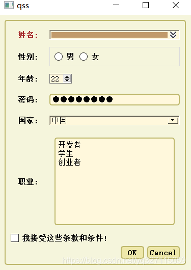
效果图:
转自:使用Qss设置窗体样式_cloud_yq的博客-CSDN博客_qss设置样式