阅读中文文档 请点击这里
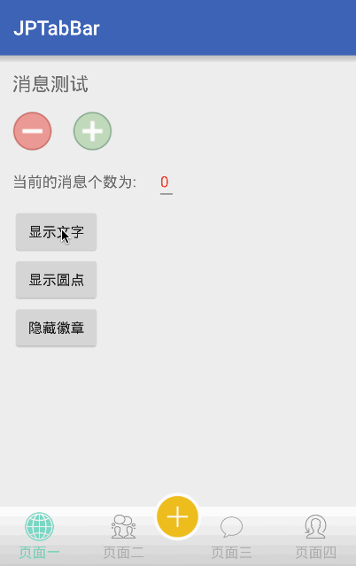
ScreenShots:
-
[x] More Animation effects of multiple Tab switching
-
[x] Implements the effect of the middle button of the bottom navigation
-
[x] Implements like Wechat icon filter and provide animation change.
-
[x] Implements the red mark on the TabBar, and can drag
-
[x] Provide listening to the click event, middle click and badge is dragged away the interface
-
[x] Reference annotation method, construction TabBarItem
1.Introducing Gradle dependency
repositories {
        jcenter()
    }

    dependencies{
        compile 'com.jpeng:JPTabBar:1.2.3'
    }
2.Add JPTabBar to your main interface layout
3.In your main interface using an array of variables to declare an array of variables, the internal reflection to generate TabItem, attention is:NorIcons are required, the length of each array should be consistent
@Titles
    private static final String[] mTitles = {"页面一","页面二","页面三","页面四"};

    @SeleIcons
    private static final int[] mSeleIcons = {R.mipmap.tab1_selected,R.mipmap.tab2_selected,R.mipmap.tab3_selected,R.mipmap.tab4_selected};

    @NorIcons
    private static final int[] mNormalIcons = {R.mipmap.tab1_normal, R.mipmap.tab2_normal, R.mipmap.tab3_normal, R.mipmap.tab4_normal};
Or, you can init in the oncreate
mTabbar.setTitles(R.string.tab1, R.string.tab2, R.string.tab3, R.string.tab4)
                .setNormalIcons(R.mipmap.tab1_normal, R.mipmap.tab2_normal, R.mipmap.tab3_normal, R.mipmap.tab4_normal)
                .setSelectedIcons(R.mipmap.tab1_selected, R.mipmap.tab2_selected, R.mipmap.tab3_selected, R.mipmap.tab4_selected)
                .generate();
After above, the layout of the TabBar basically has been built. If you want to achieve Wechat kind of gradual change as there are automatically ViewPager to change the function of the page, only in the oncreate Activity method, adding a line of code:(Of curse,If you don't use ViewPager,You needn't use this method)
//The parameters must be extends ViewPager
    mTabbar.setContainer(mPager);
In addition, if you want to achieve the effect of the highlight button, you need to add the following code in the current widget of the XML, you can use getMiddleView method to get the view you custom in attribute.
jp:TabMiddleView="@layout/你自定义的 layout"Method and node description: The Main Method Of JPTabBar:
/**
     * Set custom Tab toggle animation
     */
    public void setCustomAnimate(Animatable customAnimate);


     /**
     * Show the BadgeView With Text
     * default is false ,cannot drag
     */
    public void showBadge(int position,String text);

    /**
     * It is the same with the up method,But the different is,
     * The Badge Can draggable when you use true.
     */
    public void showBadge(int position,String text,boolean draggable);

    /**
     * set the icon and title filter when scroll page and click the tab
     * default value is false
     */
    public JPTabBar setUseFilter(boolean filter);

    /**
     * Set the boolean If Need the PageAnimate
     * default value is false
     */
    public JPTabBar setUseScrollAnimate(boolean scrollAnimate);

    /**
      *Show the Circle point
      */
    public void showCircleBadge(int pos);

    /**
      * Set the Badge Message Count Limit
      * If you use ShowBadge(int position,int count)
      * If the Second parameters > limit , it will show "limit+"
      * you can see the screenshots
      */
    public void setCountLimit(int limit);

    /**
     * Hide the OVAL Badge
     */
    public void hideBadge(int position);

    /**
     * Switch Tab page
     */
    public void setSelectTab(int index);

    /**
     * Set the Observer of the Click Tab Event
     */
    public void setTabListener(OnTabSelectListener listener);

    /**
     * set the CallBack of the Badge Dragging Dismiss
     */
    public void setDismissListener(BadgeDismissListener listener);

     /**
      * get the TabMiddleItem View that you set in "TabMiddleView" attribute
     */
    public View getMiddleView();
Attribute Explain:
Attribute Name
Attribute Explain
Parameter Type
Default Value
TabNormalColor
Font and icon of the normal color
color
0xffAEAEAE(Gray)
TabSelectColor
Font and icon of the selected color
color
0xff59D9B9(Cyan)
TabTextSize
the textsize of the bottom text
dimension
14sp
TabIconSize
the icon size of the tab
dimension
24dp
TabIconFilter
Set the icon change by the font color
boolean
true
TabMargin
Set the icon distance above and below the distance from the text
dimension
8dp
TabSelectBg
Set the TabItem Selected bg
color
transparent
TabAnimate
The animate type of the Tab Switch(None,Scale,Jump....)
enum
Scale
TabMiddleView
The middle View of the tab
layout
无
TabMiddleBottomDis
Midlle icon bottomMargin from TabBar
dimension
20dp
TabMiddleHMargin
MiddleIcon both the left and right margin
dimension
24dp
BadgeColor
The background of the badgeView
color
#f00(RED)
BadgePadding
The background expansion distance of the badge
dimension
4dp
BadgeTextSize
The textSize of the Badge
dimension
10dp
BadgeVerticalMargin
The badge vertical margin
dimension
3dp
BadgeHorticalMargin
The badge hortical margin
dimension
20dp
Matters needing attention
1.If you have given setContainer TabBar, do not setOnPageChangeListener to ViewPager
/**
    *If you already have the TabBar set up the container,
    *and then call this method,
    *the kind of WeChat that drag the gradient effect and automatically switch the page will be invalid
    *If you want to listen to the page to change the event, you can use the TabListener
   */
  mPager.setOnPageChangeListener(this);
2.If you want to achieve the middle of the button, you parent ViewGroup must be RelativeLayout or FrameLayout,because the TabBar Add MiddleIcon into it is depend on the parent Layout
3.If you want to Disable the scroll of ViewPager,you can use NoScrollViewPager in my demo
Update Log V1.1.2- Add the Bouncing of the Animation
- Reverse don't click when have no Pager in the Adapter
- Reverse the Bug of When the Pagers count of ViewPager less than or more than the count of tab
- Add the Color FIlter to the Tab Icon When user Switch Tab
- Add the Another init item method
- solve the drawable in the same memory problem,Every time finish the activity,have no Icon show.
- Remove the limit of the titles,You can set without titles
- Fix the position of the badge again
- Add some methods and Update some method's name
- Add the title Filter
- Remove the BadgeDraggable Attribute,and replace with the ShowBadge method
- Add several methods to reduce the TabBar limit
- Fix the problem of height and remove the TabHeight attribute
- Fix BUG, when the app run gradient problem
- Fix Bug,When setUseScrollAnimate (false), the slide TAB animation is not restored
- Change the Filter and ScrollAnimate default is not open
- Change the location of the Badge to the top of the level, in order to adapt to the screen adaptation
- Fix the bug of Touch outside area not responseable in the MiddleIcon Click Event
- Add some dymanic Methods in TabBar
- Add Attributes in MiddleIcon set
- Fix some problems or bugs.
- Updated RotateAnimater
- Add Custom Middle View to replace only Icon
A college student, is still in the study of various techniques... E-mail:peng8350@gmail.com