A container of toggle buttons, supports multiple / single selection and button customization.
Gradledependencies {
compile 'com.nex3z:toggle-button-group:1.0.2'
}
SingleSelectToggleGroup

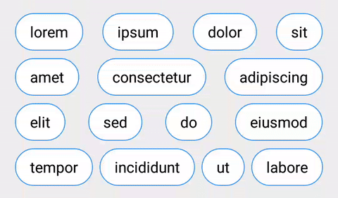
You can create a group of single-select toggle buttons with SingleSelectToggleGroup.
MultiSelectToggleGroup

You can create a group of multi-select toggle buttons with MultiSelectToggleGroup.
Flow Buttons to Next Row
With tbgFlow attribute set to true, buttons are allowed to flow to next row when there is no enough space in current row. With tbgButtonSpacing set to auto, buttons are evenly placed in each row.
ListenersFor SingleSelectToggleGroup, use OnCheckedChangeListener to listen to the change of the checked button. UsegetCheckedId() to get the id of the checked button.
SingleSelectToggleGroup single = (SingleSelectToggleGroup) findViewById(R.id.group_choices);
single.setOnCheckedChangeListener(new SingleSelectToggleGroup.OnCheckedChangeListener() {
    @Override
    public void onCheckedChanged(SingleSelectToggleGroup group, int checkedId) {

    }
});
For MultiSelectToggleGroup, use OnCheckedStateChangeListener to be notified of any changes in the group. Use getCheckedIds() to get the ids of all checked buttons.
MultiSelectToggleGroup multi = (MultiSelectToggleGroup) findViewById(R.id.group_weekdays);
multi.setOnCheckedChangeListener(new MultiSelectToggleGroup.OnCheckedStateChangeListener() {
    @Override
    public void onCheckedStateChanged(MultiSelectToggleGroup group, int checkedId, boolean isChecked) {

    }
});
Custom Button

You can implement custom toggle button in three ways,
- Extend CompoundButton class
CompoundButton implements Checkable interface, toggles itself when being clicked and provides listener forToggleButtonGroup to keep track of its checked state. CompoundButton is basically a Button / TextView. You can add your custom style and behaviour to the button like CustomCompoundButton from the sample.
- or, implement ToggleButton interface
If you choose to implement ToggleButton, besides the Checkable interface, you also need to implement asetOnCheckedChangeListener(), which allows ToggleButtonGroup to listen to the changes of any checked states. You need to handle the click event on the button and toggle its checked state properly, asToggleButtonGroup will not toggle the button when it's being clicked. CustomToggleButton from the sample is a simple toggle button implementing ToggleButton.
- or, extend CompoundToggleButton class.
CompoundToggleButton implements ToggleButton and toggles its checked state when being clicked. All you need to do is to design the look and feel for the checked and unchecked state. CustomCompoundToggleButton from the sample extends CompoundToggleButton and uses a flipping animation for state transition as shown above.
For more detail, please check the sample.